Friday 3 December 2010

My Animation

I managed to create a liquid metal character with eyes, nose and mouth. The eyes took me a while to make as I had to create two sphere shapes, get them the right size and place on the head. I also made two small pupils which were difficult to attach to the eyes.
I made my character smile and bounce by stretching certain parts using 'Vertex', I made my character squish as it hits the ground before it bounces again, which I really like.


Liquid Metal Character 1 from Chris Thorby on Vimeo.

I made my character roll in, which was quite difficult. I had to turn it slowly as I moved it forwards. I have made it bounce and squish as it hits the ground, showing its not a completely solid shape. This took me quite a few days to create. I had to get the timing right for the bounce, not making it too slow or too fast.


Liquid Metal Character 2 from Chris Thorby on Vimeo.

I have used 'Melt' to make my character become a puddle of liquid metal and I have made it re-form into the letter 'C'. I could only create the 'C' from the character itself so you can see the eyes and mouth distorted. I would like to have made it a smooth 'C' shape


Liquid Metal Character 3 from Chris Thorby on Vimeo.

I have attempted at making the 'C' more of a smoother shape and I've made it instantly form the 'C' as it comes from the puddle instead of becoming the character first. I like this one much better as you can't see any distorted facial features.


I was inspired by the T-1000 from Terminator 2: Judgement Day (Directed by James Cameron). I loved the way it can bend and morph, turning from a liquid to a solid shape.

Friday 26 November 2010

3ds Max

I've had my first seminar using Autodesk 3ds Max and I have found it really hard to use. The program is so complex with so many features.


I followed a tutorial given to me in the seminar to create a blob character. I had a few problems, one problem I haven't been able to change is the shape of the inside of the mouth, it came out distorted - the back of the mouth is not straight and flat.


I have been trying to learn more about the program by watch tutorial videos on YouTube. I followed a tutorial about how to create a morph animation and tried to make a sphere stretch and bend to the letter 'C'. I got a liquid metal texture from the internet as I wanted to create something similar to the T-1000 in 'Terminator 2' (Directed by James Cameron). This took me all day to make and is only 3 seconds long, what I would like to do is make it so it forms into solid 'C', instead of looking like this stretched blob. This is my first animation on this program.


Morph Test 2 on 3ds Max from Chris Thorby on Vimeo.

This is my second morph test, I used the melt modifier to start off with so the 'C' forms from a puddle of liquid metal, which looks much more interesting. I have used text to create the letter 'C' and made it 3D with 'Bevel', I have animated it to make it spin. I tried to make my liquid metal morph into the text 'C' but it didn't work, I hope to learn how to do this. I would also like to create a metal character the 'C' can morph into or have the character morph into the 'C'. I made this animation last longer by adding more frames. I have used 500 frames for this, I used only 100 for my first morph test.


My liquid metal creature I created. I made it with one eye, but I don't really like it being black and white as it doesn't fit with the liquid metal look. I need it to be completely metal looking including the eye but I need to show a pupil.

Monday 22 November 2010

Business As Usual - My Edits

Edit 1

Business As Usual - Edit 1 from Chris Thorby on Vimeo.

The first group edit was done really quickly and my last name was spelt wrong. I have changed it and added capital letters where's needed to make it neater. I have also added a new font, one I think is far better than the basic black "Arial". I think this font is more clear.

Edit 2

Business As Usual - Edit 2 from Chris Thorby on Vimeo.

I have cut where the argument begins and enlarged it, so I crop out the background that can be seen at the top. The sheet is meant to fill the whole frame.

Edit 3


Business As Usual - My Edit from Chris Thorby on Vimeo.

I have changed the font of the titles and I have used harsh cutting for the argument to make to more aggressive. It's not really a one shot film now because I have cut it but it's an edit I really wanted to do. I have used the editing to create the close ups, as if it were the camera. I could of filmed more scenes and edited them in but that would have completely changed it from being our one shot film, I wanted to use only what we filmed and see what I could do with the editing. I have drawn attention to the hand gestures as they show the argument best by themselves. Olivia is pointing and shoving in this argument, whilst Alex is holding out his hands questioning and denying what she is accusing him of. I just love the difference between their hand gestures, it works better than showing the face shouting.

I think making lots of cuts definitely works for this argument, the way we are moved all over the place in terms of what we are seeing puts us on edge and makes it more tense.
There is a moment where Olivia begins to smile during the argument in the orginal edit which makes you realise the argument isn't real. I managed to enlarge the film and crop out her mouth showing just her hands and part of her body. I have enlarged parts of film to create the close ups and I managed to cut out a lot of the background that could be seen behind the 2nd backdrop, which I'm really happy about. I think the editing I've done makes the film far more engaging.

Thursday 11 November 2010

Evaluation of Interactive Space Project

http://makingnewmaps.com/maps/Chris_Thorby/index.html

I have finished my interactive space project. I have never done anything like this before but after following some basic instructions I managed to work a lot of it out myself. I am quite pleased with how it looks, people just expect it to be just bedrooms so it's shocking to see a giant eye or hands reaching out of a room. I really like Room 355 where you can look around the town; the pubs and church as when you hover over one of them buildings a brief piece of history is shown. This is Reepham, my home town and you enter it through my room. I wanted to give people a little tour around where I live, it educates people on some of the history of Reepham which makes it interesting and engaging. I had to get some help with making this text box appear as the text on mouseover didn't show up long enough for people to read.
I didn't use the text 'Enter' to click on, instead you can just click on what's inside the door frame to enter. There was no need putting this text there as I made it so 'Enter' appears on mouseover.
I was going to edit the hallway so it looked more dark, scary or stylized using Photoshop but then I thought the fact it looks like a normal hallway makes it far more shocking when people find whats behind each door. The ways I would improve this project would be to add more images for the hands, I would like the hands to reach further out of the door when you keep clicking until you get to a black screen when they have reached too close.

Influences:
Bill and Ted's Bogus Journey - Directed by Peter Hewitt (1991)
In the scene where Bill and Ted go to hell there is a maze of corridors with doors. When Bill opens one of the doors he becomes young and enters his childhood nightmare. The room is bright pink and the shapes are abstract and exaggerated.


Beetlejuice - Directed by Tim Burton (1988)
There is a scene with an abstracted corridor, which is very similar to German Expressionism. It's full of diagonals and everything is slanted. The floor is uneven, the doors are exaggerated and the ceiling seems to get lower further down the corridor. One of the doors' blinds rolls up by itself revealing the lost souls in one of the rooms.


I liked the idea that each door of a corridor would lead you into a completely different place from the building like a town, a different world or a nightmare. In 'Beetlejuice' the corridor is made to look scary and nightmarish so the audience are already tense before a door is opened, with my interactive space project the shock comes after the door is opened as the corridor looks perfectly normal and I really like that about my project.

Monday 1 November 2010

Interactive Space

I have been taught how to use html in Dreamweaver. My idea is based on doors in my hallway, I want people to click on a door and behind each one is something odd and abstract. I have used Photoshop to edit these images, I have used one photo of an open door which I will repeat for the other doors. I've done this as it was really hard to get a good photo of the door as the corridor is so narrow, the walls came out curved and distorted which I had to correct in Photoshop. I have used Photoshop quite a lot when I did Photography A-Level so I know the program quite well. I have only done a couple of doors as the editing took me quite a long time to get right, I had to make the subject in the room look like it fits with the door frame so I had to adjust shadows, lighting and use the dodge and burn tools. I sketched a few ideas in a small book, but the two I liked the most was a giant eye and hands coming out of the door as it looks quite scary and nightmarish.

The sequence 
You will be able to click on one of the 4 doors to view the closed door and then have the choice of whether to open the door or go back to choose another one.

The Start (Hallway)
Room 332
There will only be the one option to 'Go Back' which goes to the hallway.
I could make it so when this image is clicked on there will be another edit of the hands reaching closer and then a black screen.
Room 333
There will only be the one option to 'Go Back' which goes to the hallway.
Room 354
There will be 2 options: 'Go Back' or 'Enter'
The 'Go Back' option will take you to the hallway. The 'Enter' option will show you the full landscape (shown below)
Room 355
There will be 2 options: 'Go Back' or 'Enter'
The 'Go Back' option takes you to the hallway and the 'Enter' option shows the Reepham Market Place (image below)
There will be options to click 'Left' or Right', view the church or 'Go Back'.
Church:
There will be some brief information about the two churches here when the cursor hovers over part of the image. I will use a small piece from this website: http://www.reephambenefice.org.uk/reephamchurchhistory.html
There will a 'Back' option which goes to the market place.
Left (from market place)
The Old Brewery House Hotel - I will use a brief piece of information taken from this website for the mouseover:  http://www.reepham.org.uk/The_Society.htm
There will be a 'Back' option which goes to the market place
Right (from the market place)
The King's Arms - I will use a brief piece of information taken from this website for the mouseover:  http://www.reepham.org.uk/The_Society.htm
There will be a 'Back' option which goes to the market place

1. Hands
I have used the hands from two images, adjusted the levels and used the burn tool so the hands look like they are coming out of the black background.
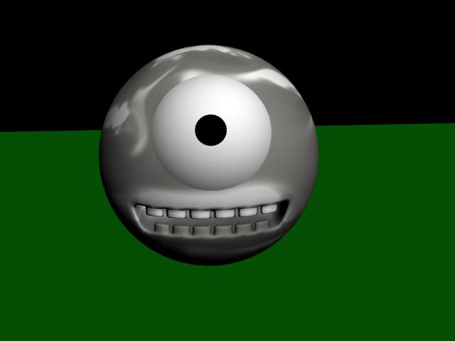
2.Eye
I have enlarged an image of my face, put the photo in black and white, adjusted the levels and used the burn tool to make more shadows. I wanted to make it really bold and striking.

3.Landscape
In this door frame is a photograph from the lake district, when you click it you are shown the full image.

4.Town
When you click on the town in this door frame you are shown the full image of the market place where you will have the option to go left or right. If you go left you will be able to view The Old Brewery House and there will be a brief piece of information on the history, if you click right from the market place you will be able to view The King's Arms and read a brief piece of information. There will also be an option to view the church from the market place with a small amount of information on its history.

I have had to use Photoshop to fix the distortion of the closed door photos, the camera made the walls looked curved so I had to use 'Transform' and then 'Warp' to adjust the images so they were straight.
Here are the original photos:

Thursday 21 October 2010

One Shot Film: Business As Usual

We filmed our One Shot film yesterday and I am really pleased with how it's turned out. We had backgrounds painted onto bed sheets which were held up, we had a camera on tracks which moved slowly through the sets along with the character who pulls them down. We used three lights, one with an orange gel and another with a blue gel. The basic idea was a guy going through a bit of his life, having arguments with his girlfriend, and wanting go out to get away from it all. We decided to bed sheets instead of creating walls, I really loved this idea as its like a solid wall that becomes weightless. The way it drops is really effective, I love all the ripples you see as it falls which I think works a lot better that using a material you could break through. The first sheet was a living room, the actor was about to light a cigarette and then hears music, he pulls down the backdrop to get to the next one which was the kitchen where the argument took place. After he pulls down the kitchen backdrop he gets to a club which we created by playing a video of a live performance on the projector, which worked really well. We orginally was going to use a black sheet and use the lights and gels to create the club but the projector was much better, he really looked like part of the crowd. There was a few problems in trying to hold up the sheets so we had to get more people in to help, if we had lots more people we could of used more sheets for the backgrounds. We decided at the end it would be quite funny to turn the projector off and turn the lights on showing he is just on his own in a room and that it wasn't real, this looked quite good but we ended up getting a box on the screen saying "Power Off". I suppose because we turn the projector off anyway it doesn't really matter, but I would prefer it if that message didn't come up on screen. Also the second sheet wasn't held high enough so you can see some of the video behind it which is a bit disappointing.
Some of the group did a quick edit adding the titles and credits with the music on top, all I would do is perhaps change the font as its very basic and see how I can cut it to make it more interesting and engaging.


Business As Usual from Chris Thorby on Vimeo.

Sunday 10 October 2010

My Design Process

The first thing I do to is to make a mind map with the theme of my project in the centre. I would then find three of the best ideas from that and research artists for more inspiration. I would look into different styles and techniques and how I can make my work unique. The internet is always a good place to start for research but lots of other things have inspired me such as adverts, films, nature, buildings, even ripping things from magazines - which I can then use that to make some drawings. Group discussions and talks with tutors helps a lot with my design process, I get to talk about my ideas and plans and if they can work or not, or when I'm completely lost.
One piece of work I've done in my art foundation was a film of me and my brother fighting with wooden Kali Escrima sticks in our back garden. I worked over the top of the frames, adding a very dark, black and white comic book style to it, removing all of the background and adding rain. 

To come up with this idea I used a small sketch book to put down lots of notes and sketches and I researched artists that had similar styles or techniques that I could use in my work. I wanted to do the fight scene the most as it's theme I wanted to work on, which was martial arts. I had to fit this around the theme I was given for this project which was urban environment, so I decided to use animation to transform me and my brother's fighting into a street fight. I sketched a lot of ideas in a small pad which included the choreography of the fight, the animation - what will be inverted, silhouettes etc. and the storyboards so I had the best selection of shots. I also keep a notebook at hand to put down any rough ideas that just come to me.


Once I had my fight scene filmed I put it into Adobe Premiere and exported a third of all the film frames, I can then use each frame 3 times and have less to edit. I used Photoshop to put on a basic black and white filter effect on all the frames and using a graphics tablet I edited out the backgrounds, drawn in the figures, created silhouettes and layered rain. 


The Process

Original Frame

Added Filter Effect

Removed background and drawn in figure as white silhouette using a graphics tablet

Created rain with and drawn dots using graphics tablet

Here is my film with the animation over the top. You will notice near the end the background hasn't been removed with the black and there is no rain, this is because I didn't manage to finish it on my course and I haven't been able to get hold of the program I used.


Saturday 9 October 2010

One Shot

08/10/10
We only had a short amount of time to come up with an idea for a 1 minute film. We had a few rough ideas, one required a pigeon suit which we couldn't get hold of so we decided to create a film of a stabbing in a graveyard. We filmed this from a low angle showing only the feet to hide the identity of the killer, only the victim (played by me) is seen as he falls to the ground with his wound. I had some fake blood on my hand which I put on my stomach to create the look of the wound, which worked really well. We had to rush this as we had a small amount of battery left in the camera so its shorter than we hoped. If we spend more time re-making this we could put markers on the ground so the actors know where to stand, I think it would also be good if the victim falls closer to the camera so he is in close up. I really enjoyed the short session we had of filming, can't wait to do more!

Wednesday 6 October 2010

Induction week

Pinhole Photography
28/09/10

As part of my induction week I had two creative group exercises. The first one I did was to create a pinhole camera using a 500ml can. I cut off the top of the can and made a lid using black paper, this had to be completely sealed from any gaps using tape so no light could enter the can and ruin the photograph. I used a needle to pierce a hole and used a simple piece of black tape to cover it, for the shutter. When I was in the darkroom I removed the lid and curved the light-sensitive paper into the can, making sure the paper did not cover over the hole. I went out and attempted to capture part of the Arboretum by the Waverley building. I peeled off the tape which covered the hole and waited 8 seconds before putting it back on, but I think I must have counted it far too quickly as I ended up with just a small section of grey from the trees with the rest of the image white. This is obviously disappointing but I found it fun anyway. I've never done pinhole photography before and I would quite like to it again.


My terrible first attempt


Close up of the only thing that came out, I think it's part of the trees.

Whiteboard Animation
29/09/10

This is the second group exercise I did and enjoyed this one the most. I have done some drawn animation before but I found using a whiteboard so much easier! you don't have to keep tracing it each time or use lots of paper, you can just work on one surface and easily rub anything out. Every time something was drawn we captured it with the camera, drawing the characters in a slightly different position each time. It was really good to watch it back, seeing everything move. 


Wednesday 29 September 2010

The beginning

So I have just set up this blog for my Multimedia course I am doing. I have been enjoying freshers week and am really excited about this course.